Friday

Evaluation

What skills have you developed through this module and how effectively do you think you have applied them?
I feel i have developed a range of skills which improve me as a designer. Over the course of this module its helped me manage my time better. I think i managed to apply the skills well enough to get things done on time and for the time i had set. Its helped me organise and balance my work more than i had before which again allowed me to give the right amount of time to each project. I think i didn't apply them as effectively as i could as i feel the wagamama brief i could have spent more time on. Skills in me producing packaging has also improved and i feel that its been applied quite effectively as the crisp packet design i feel is quite a strong piece and works really well.

What approaches to generating work and solutions to problems have you developed and how have they helped?
The way i work has changed mainly through the Doritos brief as i looked at a larger range ideas and possibilities considering how each aspect should look and i think the designs look better for it. More time has been spent i feel evaluating my work continuously than on previous briefs; using crit feedback more to improve my work. During the Doritos brief i would have liked to try and print on foil but that would have been difficult so i tried to print on glossy for a similar effect however i wasn't able to print it at the right time so had to try photograph it in a way which looked more foil/glossy like on matt paper.


What strengths can you identify in your work and how have/will you capitalize on these?
Many of the strengths i see within my work are mainly the final pieces of the doritos breif as i feel that they turned out as i expected them to. I feel the overall presentation of my work is better but still needs to be improved especially that of my ideas which despite the strength being my idea generation the weakness of it is that much of it isn't presented in a clear enough way.


What weaknesses can you identify in your work and how could you exploit these more fully?
I feel i didn't utilize some of the previously gained skills within this module and feel that my work would have looked better for it. I feel i could have tried to use more of my photography skills within the final pieces as they would have looked much stronger. I feel that the presentation of the work for the don't panic brief isn't really that strong and think its a bit messy. I don't think, for the Wagamama brief, that posters weren't as good as i had hoped as i feel the images don't quite get across the right message and i feel that i could have spend a little more time developing the idea and expanding it further for a better conclusion. I feel i still need to improve the presentation of my idea sheets as they aren't very clear sometimes and don't explain the process enough.


Identify five things you will do differently next time and what you expect to gain from doing these.

  • Time management
  • try more alternatives within an idea
  • more ideas developed and expanded on
  • annotate and evaluate more
  • look at more possibilities

How would you grade yourself in the following areas:


Attendence 5
Punctuality 5
motivation 5
commitment 4
quantity of work produced 4
quality of work produced 4
contribution to the group 4

Wagamama Finals


The finals for Wagamama haven't turned out as good as I had hoped. For the posters I feel I should have looked at a wider range of possible images and feel that if i had developed the idea more the posters would have been stronger pieces. I feel the arrow idea works but as mention in the crit the images aren't really that appealing and i'm sure whether they really want you to eat out; they an improvement over the darker versions and feel that the pastel greys work better.

Final Poster Designs

The posters i feel work as a set illustrate the idea of using the Doritos brand to have fun and make the world your playground. I feel the printouts seem to be darker than intended as this was mentioned in the final crit. I tried to brighten them but they still printed darker than they are here. I like how they turned out but feel if i had managed to get my own versions of the photos taken i feel that they would probably be stronger pieces as i feel that the resolutions of some parts of the images, such as the wave, don't work that well at a large scale.

Final Packet Designs


I wanted the packet to work along side the posters so i used elements from each poster that being the wave, clouds and the desert scene. I used the wave elements on the Doritos themselves on the design. This style i tried to continue across the others along with fitting it with the background. I like how they turned out but feel the font for the flavour i feel makes it look a little awkward and feel the usual font would be a better choice. I don't like the chilli heatwave packet as much as the others as i didn't have chance to alter the information on the back so it doesn't really feel finished. I feel i could explored possibilities for the design a little more but then i feel it might of deviated away from the posters. The alterations which include the adjustment to make it more of a compitition i feel improved the design and made the folding a triangle have more of a purpose. Overall i feel that the packet design works well but feel if i could have printed it onto foil it might have improved the design somewhat.

Skateboards and surfboards


I felt i should of produced the designs for the skateboards and short boards available. I decided it was appropriate to base the designs off of the crisp packets to help keep the same style throughout and i feel that they work rather well.

Thursday

Packet Dev

Almost Finished Wagamama Posters

After the final crit it mentioned that i should try make the posters a bit more lighter to make them more appealing

Finished and photographed Postcard


I feel this turned out better than expected but feel the back of the printed version had to be readjusted and feel that the altered version looks better.

Tuesday

wagamama Layouts

I wasn't sure how i should of arranged the type on the page. I wanted to keep the black and white to keep the Wagamama style with some red. I felt i could avoid using the neon arrow but the idea didn't have the same impact.

Monday

Stickers


I wanted to produce the stickers to show how the audience could control the brand and modify it however the feedback in the crit said that the idea was too much and needed to simplified and it was mentioned that i could do something else with the packet design. I liked how the stickers were looking but i don't think that they really would have fit with the style established with the posters.

Tuesday

3 Doritos Posters


These are the set of 3 posters i had decided to continue with i feel that they work as a set and hope that the stickers I'm going to produce will fit with the Doritos posters

Doritos Logo editing


I thought something needed to be added to the logo to tie it more to the play aspect i had to promote.

Doritos Poster Layouts


I wasn't too sure what layout to have on the posters for the type so i looked at different variations. I wanted a continuous design across the 3 posters so i decided on the 4th bottom one i chose this over the one before it because i didn't like the straight edge of the one before.

wagamama Posters


For the Wagamama i wanted to produce a set of posters which highlighted the eat out option available at the Wagamama resturant. This is progress i have made on the brief so far i don't which posters to produce yet but i am just seeing which ones work when developed ad which ones aren't.

Monday

Doritos Poster Development

Each poster will be part of a separate set of 3 posters. I feel they are all quite strong ideas and reflect the play aspect i feel the brief is looking for. I not keen on the large football one as i don't think it has the impact of the others which i feel are stronger. The surfing one i feel has the most impact and probably the one im most likely to continue with

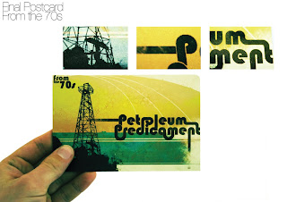
Don't Panic 70s Postcard


I finished the postcard brief. I like how the design has turned out and feel it looks quite good for a 1 day brief i feel i could take the brief further and produce a set of 60s, 70s and 80s however i really only do this if i had the time.